Hulu Plus for Roku: The Worst Interface I Can’t See
Posted: November 13, 2011 Filed under: Usability | Tags: Hulu Plus, User Experience Leave a commentI’ve been using Hulu Plus for Roku for a month and a half, and it is one of the most frustrating user interface I have ever seen. The biggest problem? I can’t really see anything.
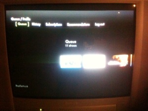
Here’s what it looks like from my couch.
You think this is a dramatization of the situation. But it’s not. Because sometimes, I sit down to watch TV without my eyeglasses. (I know, bad habit, but that’s my behavior). So this is exactly what I see. So, I have to get up off the couch and find my glasses.
Alright now. Let’s go a little closer so you can see what’s going on here.
Better? …
Hulu Plus did not put themselves in the shoes of their users with this one. Here are a few key areas clearly forgotten with this user experience:
- Design for the platform’s context. Hulu forgot that a person watching TV is sitting anywhere from 5 feet to 10 feet away from the TV. And yes, I know I live in the dinosaur age with my analog TV, but digital TVs are not going to make magic out of small white lettering on a black background.
- Relevance First, Discovery Second. When I log in to Hulu Plus, I want to see what’s new in my queue/subscriptions. I bookmarked them for a reason – because I’d like to see new episodes of the show. It takes me 3 clicks before getting to my queue. The 3 clicks itself wouldn’t be so horrible, if the queue/subscribe experience wasn’t also completely frustrating. Which takes us to..
- Assume your user knows nothing. I was not an experienced Hulu user when I subscribed to Hulu Plus. It’s been a month and a half, and I still haven’t figured out the difference between a queue and a subscription.For both queue and subscriptions, I have to click into each show, then use the sub-menu to go to an episode, then, I have to remember which episode I have watched, and click on the correct episode.
Hulu, here’s something you can assume: If I’ve watched it, I don’t want to watch it again.
Also, the menu item – “Recently Added”. The first few times I logged in, I assumed these were the shows *I* recently added. Don’t forget that customers are narcissists. They don’t care that you slaved to get “21 Jumpstreet” added to the Hulu content library. In fact, the assumption should be, (if your marketers did their job right), that the whole entire world’s library of tv shows are available on Hulu Plus.
Of course this is impossible, and so yes, perhaps customers do want to know if new shows have been added, but maybe “New to Hulu” ? …It’s even shorter.
What’s most shocking is that this is the experience for a monetizer. I am close to canceling my subscription, and it’s all because of this poor user experience. It’s almost unusable. The whole idea of Hulu Plus is that it makes watching TV easier. So then, why is it so hard to get to the shows I want to watch?


